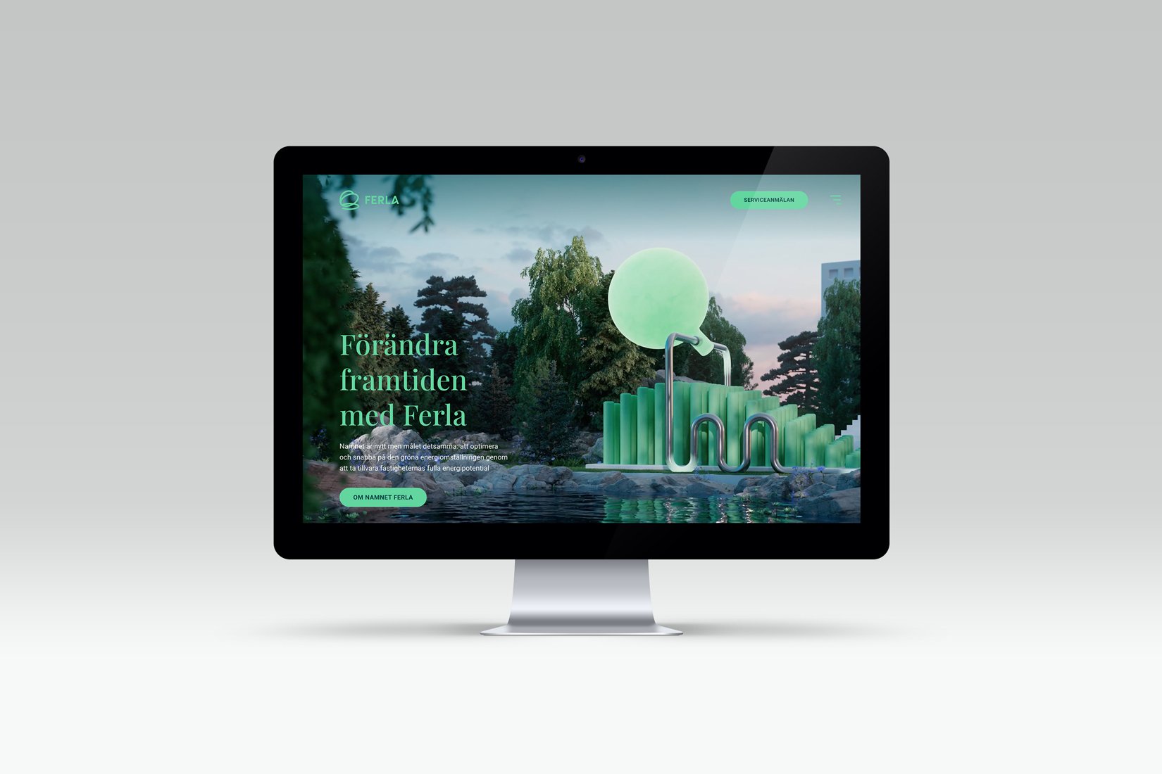
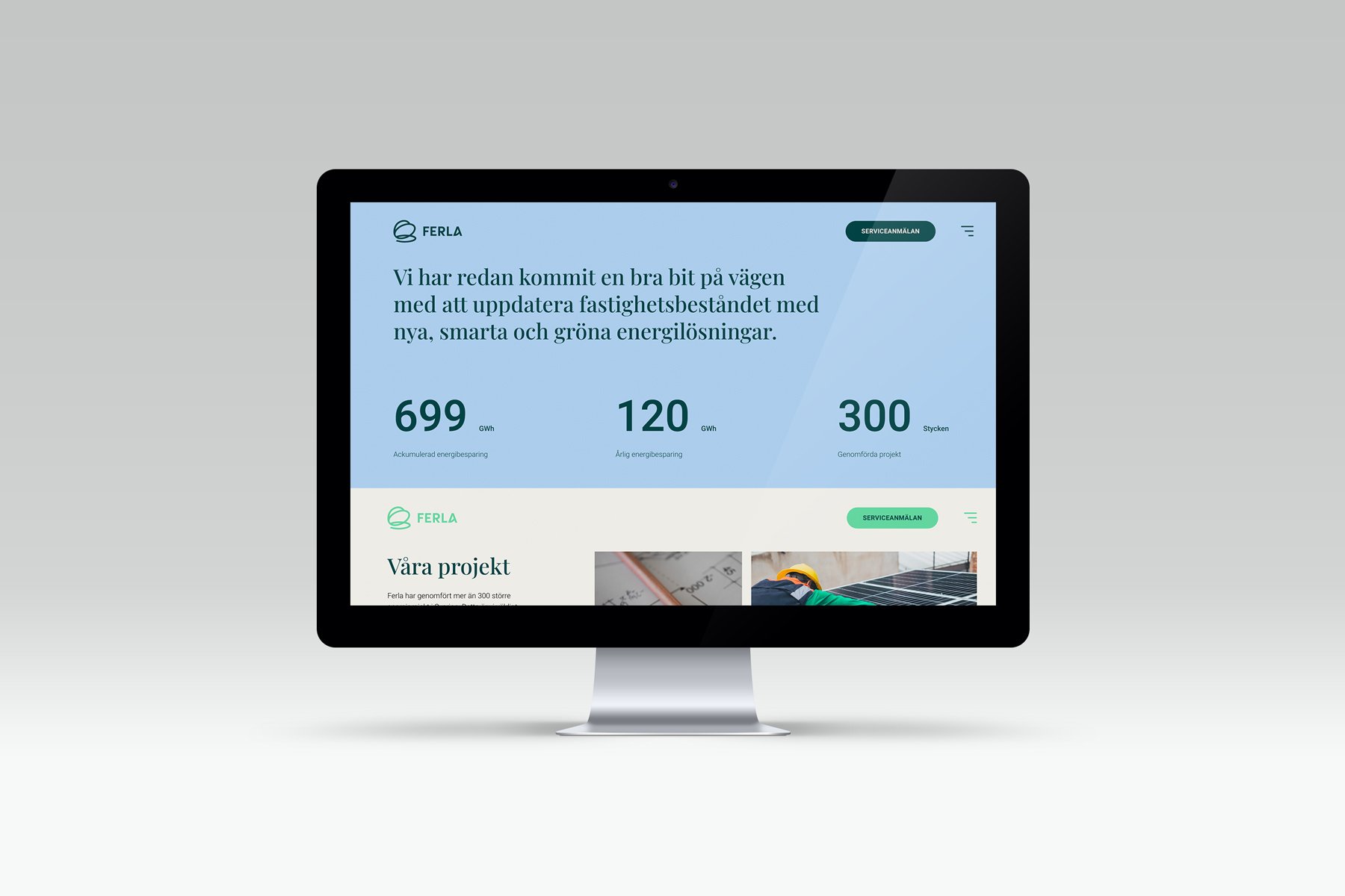
Ferla is a pioneer in the transition to 100% sustainable energy solutions for the property sector. Focused on local, reused, and renewable energy, they are leading the charge toward a sustainable future with the goal of accelerating the green energy transition.
Ferla approached us with a desire to create a clearer brand platform. This led to the need for a new name (formerly Enstar). Our task was to develop a brand identity that would support their new positioning.
The name and conceptual thread were inspired by the "butterfly effect." Just as the flap of a butterfly's wings can set off a storm, their smart solutions in a building create significant impacts, far beyond the building's walls. This principle, known as the butterfly effect, echoes a future of change. To strengthen this connection, we named the company Ferla – derived from Old Norse, meaning butterfly, and symbolizing transformation and renewal.
Ferla
-
The logo draws inspiration from a stylized butterfly, with its soft form serving as the foundation for the rest of the graphic elements, including the wordmark, infographic arrows, and image treatment, for a consistent visual expression. We also created a hero animation to demonstrate Ferla’s powerful impact on innovative solutions and their mission to optimize the green energy transition by harnessing the full energy potential of properties.
Scope: Brand plattform / Naming / Brand Identity / Animation / Motion / Copy / Printed Collaterals / Icons / Web / Signage / Staff Clothes / Guidelines etc
Collaborations: Strategy Pernille Hansson Ihrfelt, Mary Petrini Jaldeborg / Copywriting Richard Hallberg / Animation Andreas Wannerstedt / Web Development WTMG / Design Dan Bunnskog / Illustration Jenny Almén / Photography Martin Botvidsson


