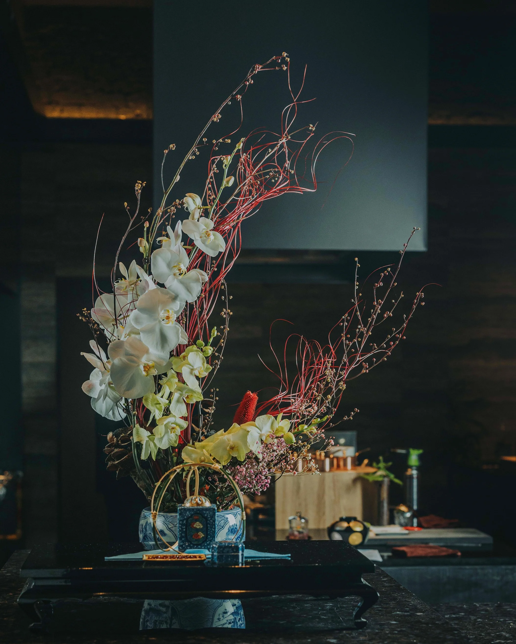
For over 20 years, Chef Hirofumi Imamura honed his craft at some of the world’s most renowned restaurants. In 2021, the Japan-based hospitality group GHS Inc. partnered with Imamura to bring his restaurant to Singapore. Oppo Studio was commissioned to create the brand identity.
Chef Imamura follows the “Philosophy of Five,” a culinary approach rooted in the ancient Japanese principles of Gomi (five flavours), Goshiki (five colours), and Goho (five methods). This philosophy culminates in an artful gastronomic experience that engages all senses.
Imamura
-
The visual concept was inspired by this philosophy. Red, the colour of joy and fortune in Japan, forms the core of the primary colour palette, consisting of five red tones that seamlessly blend together throughout all applications. A pattern based on the five core principles was designed and used as a key graphic element.
We also created a bespoke typeface, Imamura Serif, which is exclusively associated with the Imamura brand. The logotype and headlines are consistently written vertically, reflecting a traditional Japanese way of reading, which influenced the typographic treatment. All printed materials—including the menu, beverage menu, gift card, and more—are visually cohesive, reinforcing the brand identity.
Scope: Brand identity / Menu Design / Font Design / Printed Collaterals / Web Design / Signage


