Oxcala
Oxcala manufactures premium Swedish lifebuoys with the ambition to combine both aesthetic appeal and the highest safety standards, ultimately saving lives. Their main customers include hotels, beach clubs, boat clubs, and private individuals. Oxcala creates beautifully designed lifebuoys with unique personalisation options, allowing customers to choose their preferred colour, size, and text.
We were asked to develop their brand identity to support their ambitions in both the global and Swedish markets, ensuring the highest level of credibility.
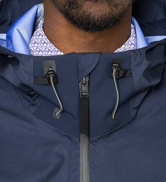
The abstract Oxcala symbol is open to interpretation from several angles: the letters 'O' and 'A' as part of the name, the 'O' representing the sun on the horizon, or a lifebuoy emerging from the waves, with the 'A' symbolising the bow of a boat cutting through the water.
Scope: Brand Identity / Packaging / Animation / Web Design
Collaborations: Design Sara Sandén / Web Development COI


