Sophie by Sophie
Sophie Gyllenhammar Mattsson founded Sophie by Sophie in 2006 with a clear vision: to create playful, mix-and-match jewellery that blends timeless pieces with a modern, edgy twist. Her favorite gemstone, the vibrant green chrysoprase, became a defining element of both her designs and the brand’s visual identity.
The design language seamlessly integrates all aspects of the brand’s new identity. From the playful logotype to the thoughtfully chosen color combinations, each element reflects Sophie’s unique and inspirational approach to design. The signature green chrysoprase pattern was developed as a tribute to Sophie’s personal love for the gemstone, which is a central visual theme throughout the collection.
-
This chrysoprase stone forms the basis of a subtle, green mottled pattern that becomes a premium and distinctive brand element throughout the fine jewelry collection. This pattern is featured across various touchpoints, including hand-painted ribbons, design accents on bags, and printed collateral.
For the fashion range, bold color combinations are paired with chrysoprase foil, creating a cohesive and recognizable brand presence that ties the collections together.
The concept of “Fun & Flair” became the basis for the brand attitude, a lifestyle and approach of inviting a bit of flair into everyday life – because why not?
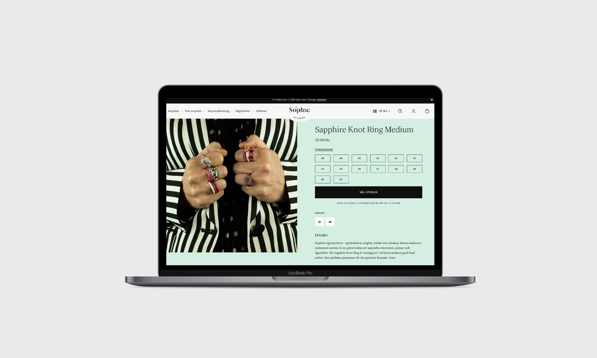
Scope: Brand Identity / Packaging Concept and Design / Printed Collaterals / Web Design / Communication / Animation
Collaborations: Copywriter Emily Bjerner / Web Development Panagora / Animation Kristian Bjureby / Packaging Production Anthony Igoe, Sian Cornish


